Table of Contents
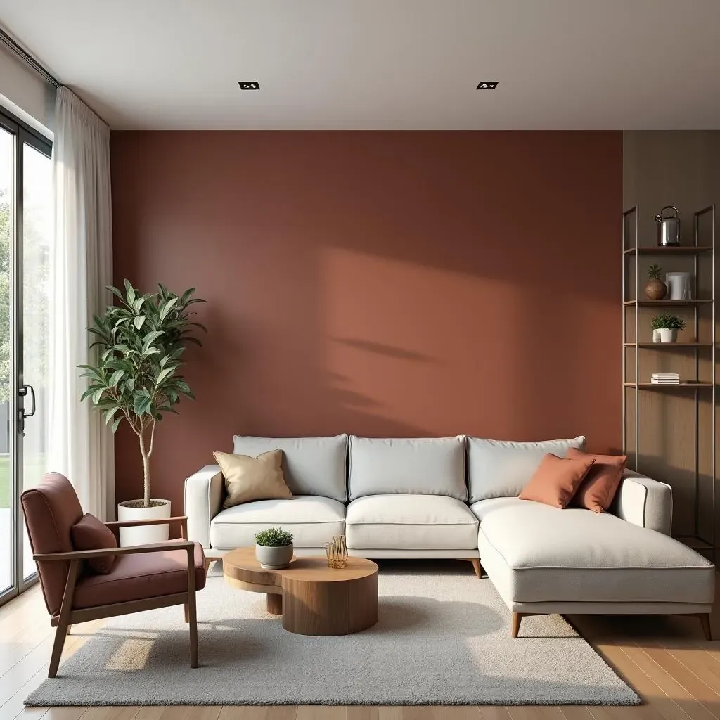
Ready to transform your space with a pop of color? Accent walls are a fantastic, budget-friendly way to inject personality into any room. And when it comes to paint, Behr offers a spectrum of shades that can truly make a statement. This article is your go-to guide for mastering the art of the accent wall using Behr paint. We'll explore Behr's top 12 accent colors, perfect for creating that eye-catching focal point. We'll also peek into the future, uncovering the 2025 color trends and how they might influence your next project. Thinking about your workspace? We've got you covered with insights on office design trends and how Behr paint can play a vital role. Finally, we’ll explore Behr's 2025 Commercial Color Forecast, offering a glimpse into the hues that will be shaping our spaces. So, whether you're a DIY enthusiast or a design pro, get ready to discover some amazing behr paint accent wall ideas that will elevate your interiors. Let’s get started!
Top 12 Behr Accent Colors for a Bold Statement
Top 12 Behr Accent Colors for a Bold Statement
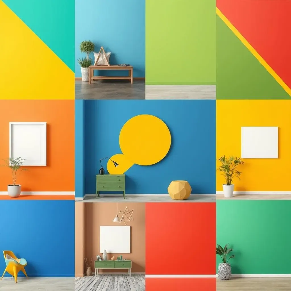
Okay, so you're itching to make a statement, right? Forget boring beige; we're talking bold! Behr has some seriously amazing accent colors that can transform a room from drab to "wow" in a single weekend. Now, an accent wall isn't about slapping paint everywhere. It's about choosing that one wall, the one that's begging for attention, and giving it a dose of pure color magic. Think of it like this: the rest of your room is the supporting cast, and the accent wall is the star. You want that color to pop, to draw the eye, and to make a room feel more dynamic. Behr gets it, and their top 12 list is a treasure trove of inspiration for exactly that.
2025 Color Trends: What's New for Behr Paint
2025 Color Trends: What's New for Behr Paint
The Buzz About "Rumors"
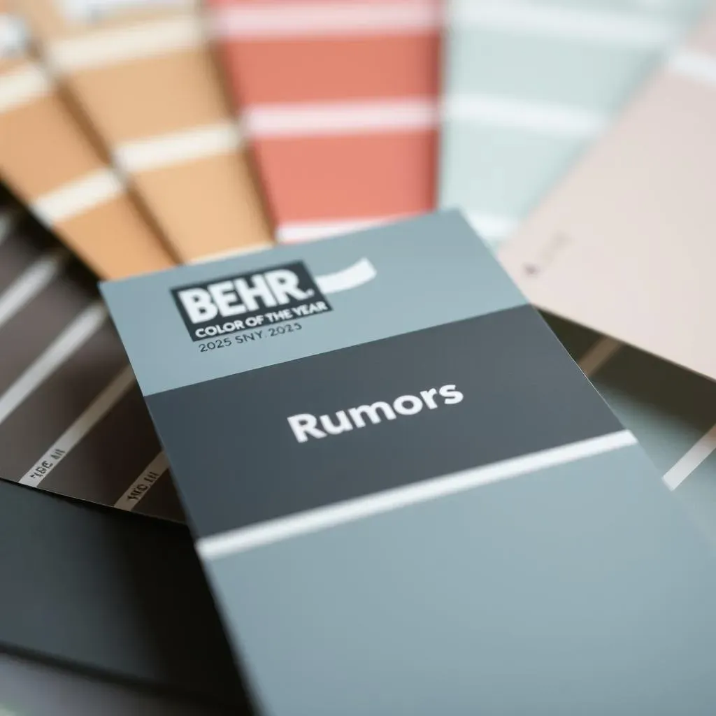
Okay, so picture this: you're at a swanky art gallery, and there's this one painting that just draws you in. It's not loud, but it's got a certain depth, a richness that's hard to ignore. That's kind of what Behr's 2025 Color of the Year, "Rumors," is like. It's this deep, almost wine-red that's not afraid to make a statement. Forget those wishy-washy pastels, this color is all about adding warmth and a touch of drama. Think cozy living rooms, sophisticated dining areas, or even a bold office space. It’s a color that says, "I've arrived," without screaming it from the rooftops.
I think what's cool is how versatile it is. You can pair it with light neutrals for a classic look, or go all-in with dark woods and metallic accents for something more opulent. It's like that one piece of clothing in your closet that just works for every occasion. The kind of color that is both familiar and fresh at the same time. Behr isn't just throwing darts at a color wheel here; they're thinking about how colors make us feel and how they can transform our spaces.
Beyond the Color of the Year
Now, while "Rumors" is stealing the spotlight, Behr's 2025 color trends go way beyond just one color. It’s like they've opened a treasure chest of hues, each one more intriguing than the last. The trends are less about specific colors and more about the feeling and mood they create. We're seeing a push towards colors that promote relaxation, connection, and a sense of well-being. Think earthy tones, muted greens, and calming blues – colors that bring the outdoors in. But don't worry, they're not all soft and subtle. There’s a good mix of bold, saturated shades in the mix too. It’s like they are saying “Hey, we have something for everyone.”
What I find interesting is how Behr is mixing the old with the new. There's this idea of blending timeless classics with modern twists. It’s about creating spaces that feel both familiar and forward-thinking. They're not just following trends; they're trying to predict what we'll need in our homes and workspaces in the coming years. It's like they're saying, "Let's not just paint walls; let's create experiences."
Trend | Description | Color Examples |
|---|---|---|
Earthy Tones | Colors inspired by nature, promoting relaxation. | Muted greens, warm browns, sandy beiges |
Calming Blues | Shades of blue that evoke peace and tranquility. | Soft sky blues, deep navy, serene teals |
Bold Saturated Shades | Rich, vibrant colors that make a statement. | Jewel-toned greens, deep reds, vibrant oranges |
Office Design with Behr Paint: Trends for 2024 and Beyond
Office Design with Behr Paint: Trends for 2024 and Beyond
The Hybrid Hustle
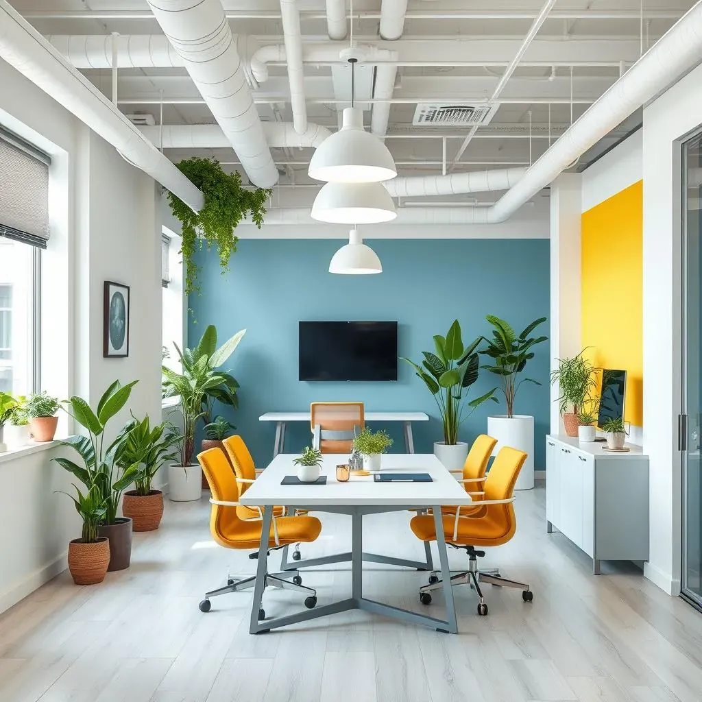
Okay, so let's talk offices, but not like the boring cubicle farms of the past. The game has changed, and it's all about flexibility. Hybrid work is the new normal, and offices need to adapt. What does that mean for paint? Well, it means creating spaces that feel both professional and welcoming. Think about it: some days, employees are in the office for meetings and collaboration; other days, they're working remotely. The office needs to be a place they actually want to be, not just a place they have to be. We're moving away from those sterile, all-white environments, and starting to see more color and personality injected into the workplace. It's about designing a space that supports different work styles and promotes productivity, while also feeling comfortable and inspiring.
Behr paint is perfect for this, because they have so many options. You can use a calming blue in a quiet work area, or a energizing yellow in a collaborative meeting space. It’s all about being thoughtful and intentional with color. We're not just painting walls; we're creating environments.
Biophilic Bliss
Have you ever noticed how much better you feel after spending time in nature? Well, that's the idea behind biophilic design, and it's a huge trend in office spaces right now. It's all about bringing the outdoors in, and color plays a massive role. We're seeing lots of earthy greens, warm browns, and calming blues - colors that remind us of forests, beaches, and mountains. It's not just about aesthetics, either. Studies have shown that incorporating natural elements into the workplace can reduce stress, improve focus, and boost creativity. So, it's not just about making the office look pretty, it's about making it a healthier, happier place to be.
And here's the cool part: you can use Behr paint to achieve this without going overboard. You don't need to turn your office into a jungle. Just a few strategically placed accent walls in nature-inspired colors can make a big difference. Think of it as a subtle nod to the natural world, a way to bring a little peace and tranquility into the workday. It's like bringing a little slice of the park into the office, without the risk of getting rained on.
Design Trend | Description | Behr Paint Ideas |
|---|---|---|
Hybrid Workspaces | Flexible spaces for different work styles. | Calming blues for quiet areas, energizing yellows for collaboration spaces. |
Biophilic Design | Bringing the outdoors in with natural elements. | Earthy greens, warm browns, calming blues. |
Wellbeing Focus | Creating a healthy and happy work environment. | Soft neutrals, muted greens, light blues. |
Color Psychology
Let's get a little nerdy for a second, and talk about color psychology. It's basically the study of how colors affect our emotions and behavior, and it's a big deal in office design. For example, blues and greens are often associated with calmness and focus, making them great choices for areas where concentration is key. Yellows and oranges, on the other hand, are energizing and stimulating, perfect for creative spaces and meeting rooms. Even the shades you choose can impact the mood. A light blue will feel more airy and open, while a dark navy might feel more serious and sophisticated. It’s all about understanding the subtle ways that colors can influence our perception of a space.
And that's where Behr's wide range of colors comes in handy. You can use color to create different zones within the office, each with its own vibe and purpose. It's like creating a mini-ecosystem within the workplace, where each area supports a specific kind of activity. It's about being intentional and thoughtful about the choices you make, and creating a space that truly works for the people who use it. Think of it like this: your office is not just a room, it's a tool. And like any good tool, it needs to be well-designed and fit for purpose.
Behr's 2025 Commercial Color Forecast: Inspiring Spaces
Behr's 2025 Commercial Color Forecast: Inspiring Spaces
A Glimpse into the Future of Color
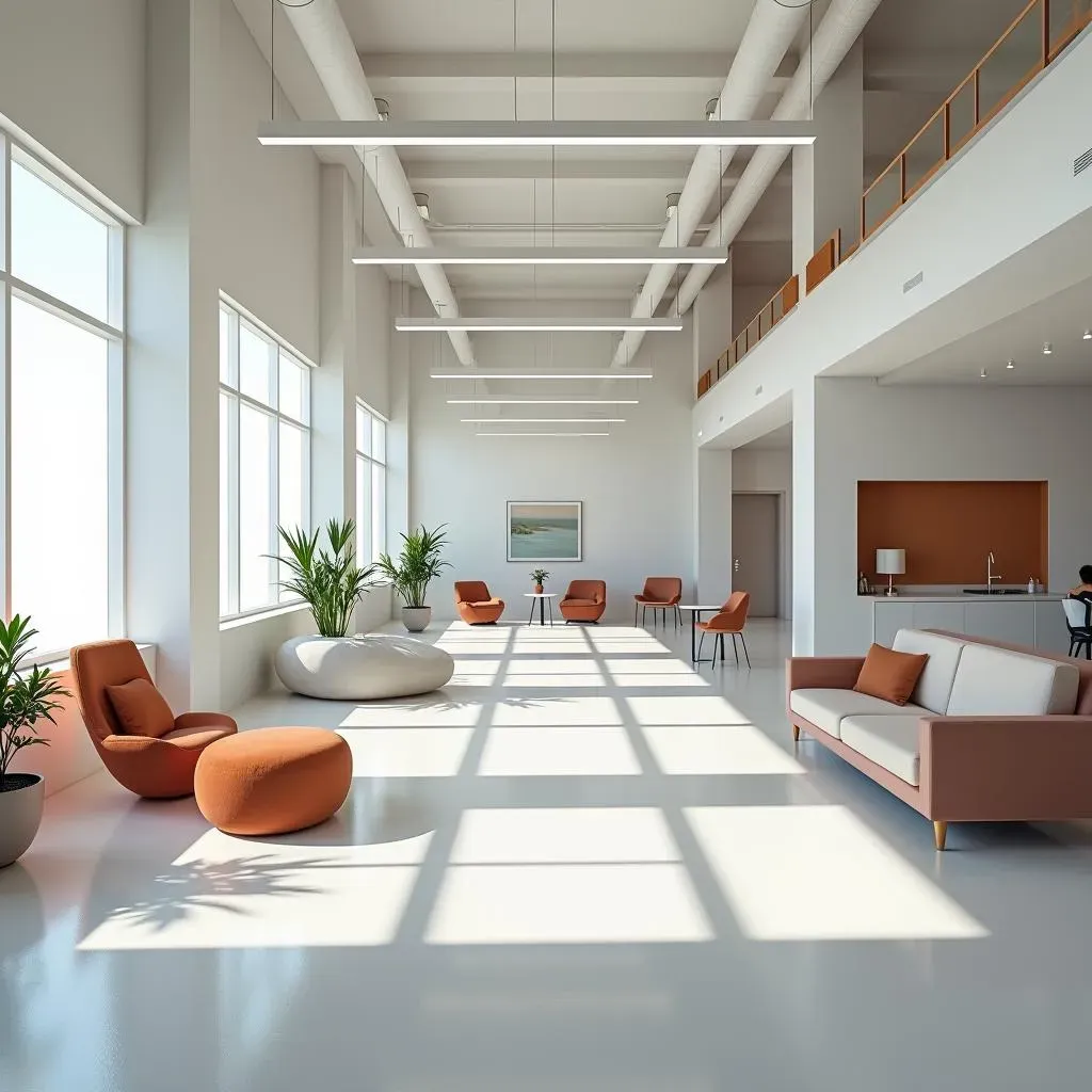
Alright, let's shift gears a bit and talk about something that's not just for homes, but for all those spaces where we work, shop, and hang out: the commercial world. Behr's 2025 Commercial Color Forecast is like a sneak peek into the future of design, and it's fascinating stuff. They didn't just pull these colors out of thin air; they actually held a workshop with commercial designers and color experts. So, these aren't just random hues, they're carefully curated based on what's happening in the world of design and how we're evolving as a society. It's like they're trying to predict the mood of the next few years, and then translate that into a palette of paints. Pretty cool, right?
What's really interesting is how the forecast is broken down into different themes. It's not just a list of colors, but a collection of concepts that explore various aspects of our lives. We're talking themes like "Limitless Whites," which explores the versatility of neutral tones, and "Bleisure," which blends business and leisure. It's like they are saying “Hey, we need colors that are flexible, that can work in many situations”. They are also looking at “Renew-trals”, which are like a fresh take on familiar colors, “Grand-luxe”, think opulent and sophisticated, and even “AI-sthetic”, which explores the intersection of technology and color. It’s like they are trying to cover all the bases, and it’s really interesting to see how they are thinking about the future.
The Themes and Their Meanings
So, let's break down some of these themes a bit more. "Limitless Whites" isn't just about boring white walls; it's about exploring the different nuances of white, from warm to cool, and how they can create a sense of space and light. “Bleisure” is all about that blurring of lines between work and play, so it's colors that are both professional and relaxing. And "Renew-trals" are like a nod to the past, but with a modern twist, colors that feel familiar but also fresh. Then you have “Grand-luxe”, which is, as you’d expect, all about luxury. Think deep, rich colors, and opulent metallic accents. Lastly, “AI-sthetic” is the most futuristic one; it's about the colors that reflect our increasingly tech-driven world, but also the importance of nature, and the balance between the two.
What I like is that it’s not just about picking pretty colors; it's about understanding the psychological impact of colors on people in commercial spaces. It’s about making a restaurant feel welcoming, an office feel productive, and a retail space feel inviting. It's like they are saying “Hey, we need to think about how colors make us feel, not just how they look”. It's all about creating a space that not only looks good but also feels right. They are thinking about how the colors interact with materials and textures to create a full sensory experience. It's like they're saying, "Let's not just paint walls; let's create experiences."
Theme | Description | Color Palette |
|---|---|---|
Limitless Whites | Versatile neutral tones for space and light. | Warm whites, cool whites, off-whites |
Bleisure | Colors that blend business and leisure. | Calming blues, soft greens, muted grays |
Renew-trals | A fresh take on familiar neutral colors. | Earthy beiges, warm browns, soft greys |
Grand-luxe | Opulent and sophisticated colors. | Deep reds, rich greens, metallic golds |
AI-sthetic | Colors that reflect the tech-driven world. | Cool blues, iridescent purples, digital greens |
